Balanced visual identity and UX/UI for a forest management web app
Client
We’re always delighted to welcome back a satisfied client! BZB UAS, a Polish start-up we previously worked with on a complex technical project, recently launched eForest. The web app combines drone surveillance with AI and algorithms to optimize forest care. This time around, the project consisted of three phases: visual identity, UX/UI of the web app, and a landing page.
Challenge
As IT professionals, we work with diverse businesses and industries. When our client invited us into the world of forestry, we gladly jumped on board. Or, shall we say, walked deep into the woods. By focusing on effective communication and benchmarking, we successfully designed a visual identity that conveys their Unique Value Proposition to target audiences. Moreover, we used this aesthetic to design the UX/UI of the web app itself and a landing page for marketing purposes.
At hero/dot, we specialise in a complete approach to branding and rebranding projects. Seamlessly connecting extensive discovery, target audience research and overall strategy provides a strong foundation for a powerful visual identity. This time, however, we have taken care of a simpler scope, nonetheless vital to the success of the new BZB UAS business:
- Logo design,
- Brand Colours,
- Typography.
Team
Design
UX/UI Designer
Product Designer
Graphic Designer
Engagement
Solution
With eForest’s visual identity, we presented a contemporary take on the traditional concept of forests. We sought inspiration both in nature, and technology, to match it perfectly with what the brand stands for. During the design process, understanding the target audience's core motivation is essential. In foresters’ case, their primary goal is to take perfect care of the forest they’re managing.
We prepared two propositions, allowing space for the client’s selection of choice.
1st proposition
Logo design
With the first logo design, we conveyed a picture of a balanced, sustainable forest. We achieved that by toying with the idea of a firmly rooted tree, cradled by the surrounding soil.
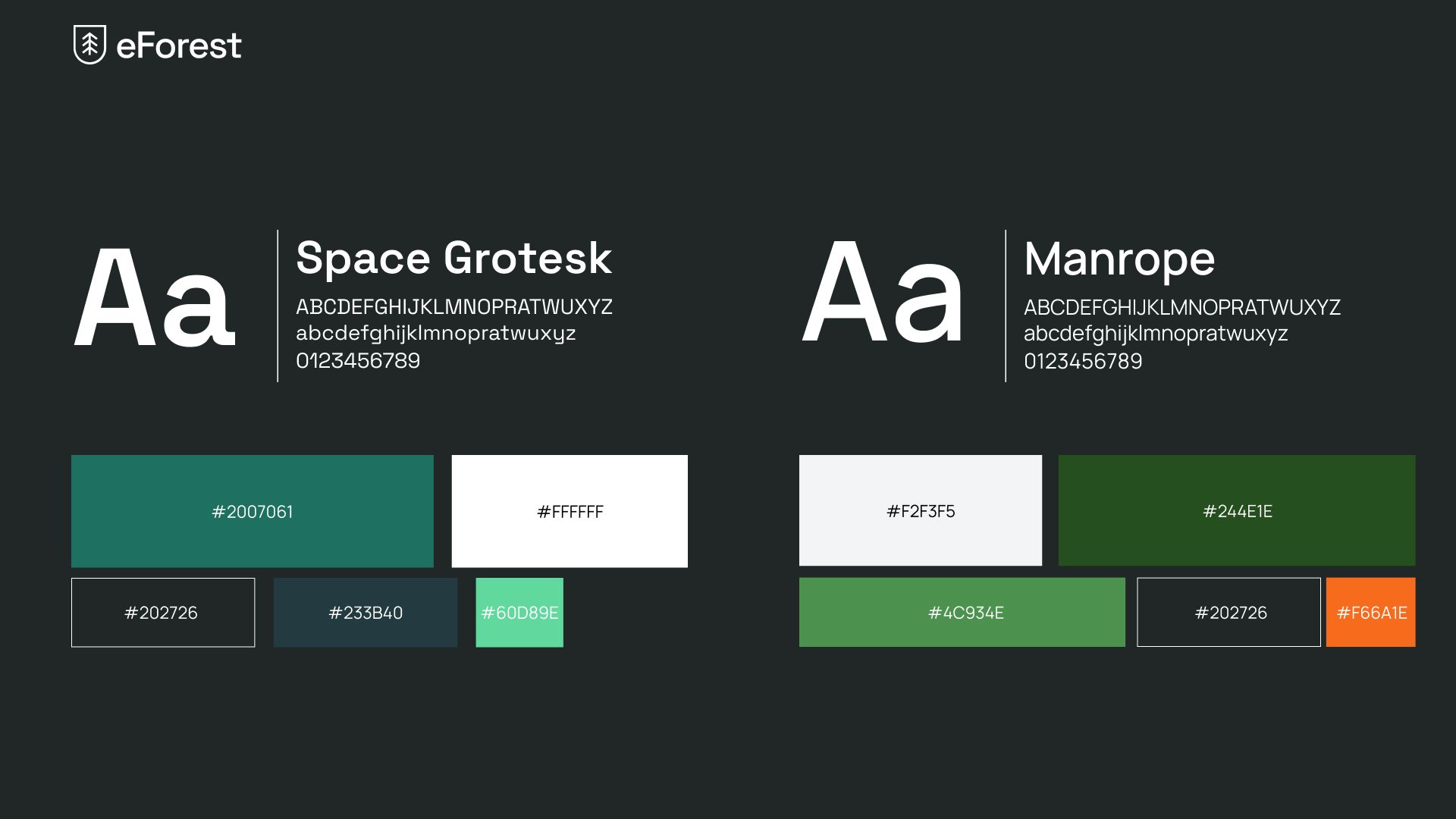
Colours
We leaned towards colours that represent the ever-changing nature.
- The cosy, vibrant green (#244E1E, #4C934E) of the trees and the dim colours of the shadows they cast (#202726).
- The bright, warm orange (#F66A1E) serves as an accent and lightens up the mood. We wanted to evoke the image of autumn leaves, fragrant resin, and tree bark basking in the warm sun.
- The serene, peaceful white (#F2F3F5) represents snow covering the ground and trees during beautiful Polish winters.
Typography
We chose Manrope, a sans-serif typeface, to further accentuate a clean, modern design. It features rounded corners and a large x-height, making it easy to read at small sizes. The letterforms are simple and geometric, with a minimalistic style that lends itself well to a wide range of design applications.
2nd proposition
Logo design
With the second logo design, we chose to show the core objective of eForest – helping to provide protection. The end result, a tree enclosed in a protective frame, serves as a visual representation of what is the most important to future users.
Colours
We leaned towards colours that represent the feel of genuine care for a sustainable forest ecosystem.
- The diverse, deep and vivid greens (#207061, #60D89E, #233B40) echo nature, growth and safety, while also indicating the sustainability and eco-friendliness of the drone solutions.
- The calm white (#FFFFFF) provides contrast to the muted black with a green undertone (#202726), representing change and bringing balance to the design.
Typography
We selected Space Grotesk, a sans-serif typeface featuring clean, simple lines. It has a modern, futuristic feel since it was created for use in space-related materials, such as NASA's visual identity system. It also allows for easy legibility in various sizes and contexts, while also meeting usability requirements in web design.
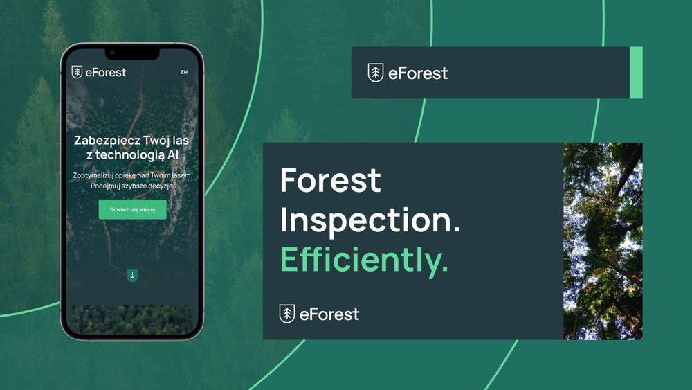
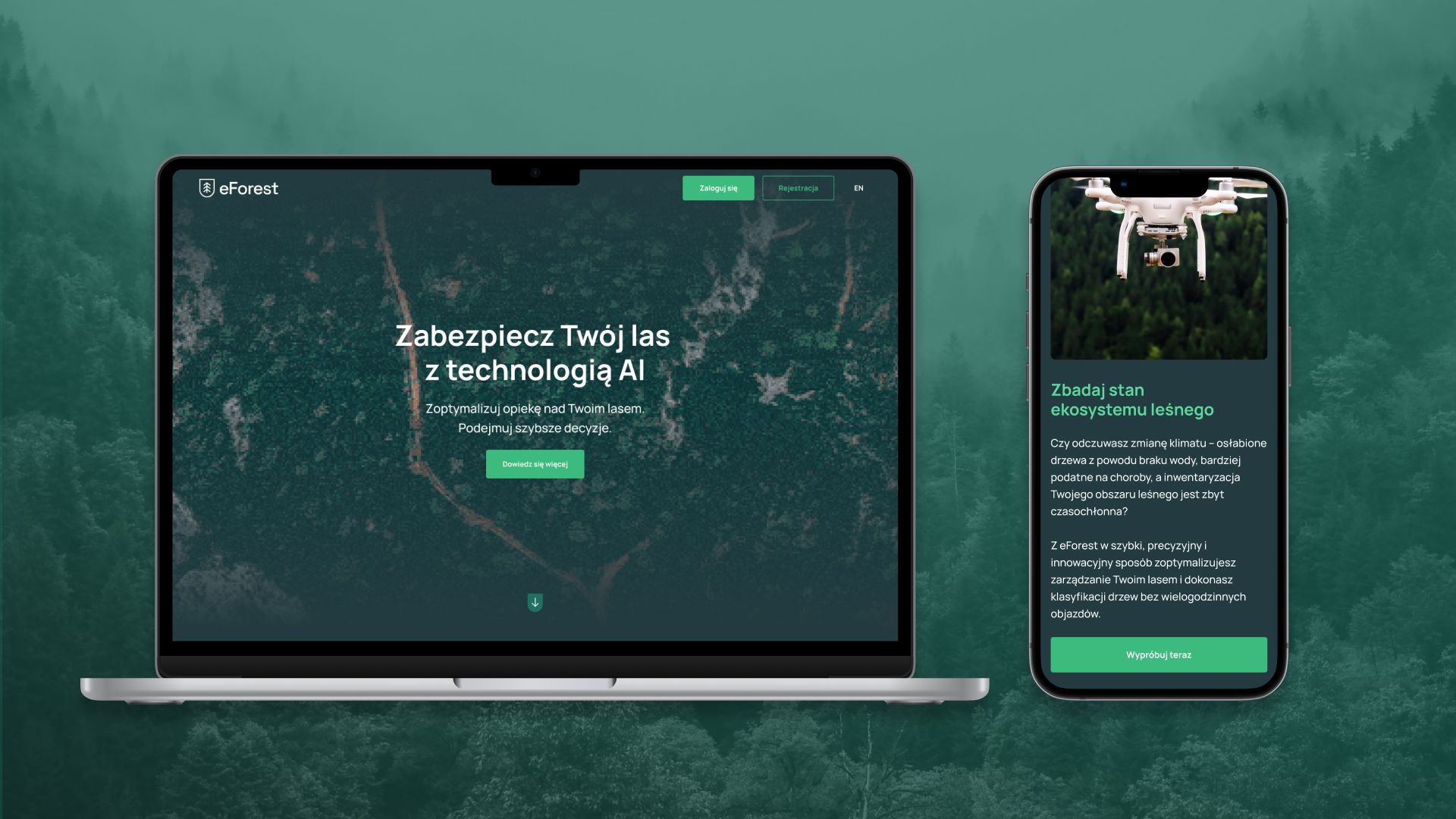
From web app to landing page design for eForest
The visual identity was merely the first part of the project, yet a fundamental one. Based on our work, we started designing the product (a web application) and a landing page, which secured the brand’s marketing efforts. First, we created the user experience of the web app, and then the final mockups. Next, we designed a simple, yet effective landing. All were coherent with the overall look & feel and aesthetic of eForest.Paweł Wypych
Product Designer at hero/dot

Results
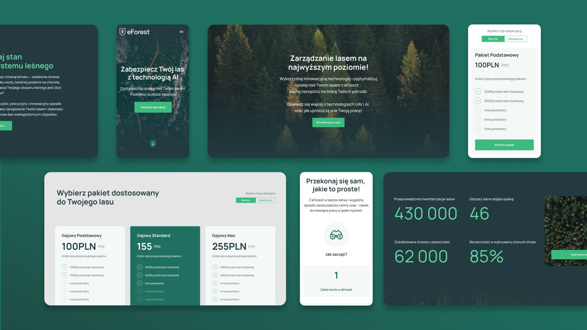
Putting the new eForest visual identity to good use, we designed the UX/UI of a web application, which was a critical component in operating the high-precision data obtained during the drones' missions in the forest. As we did with the Planner app, our design team placed a strong emphasis on creating a user-friendly and intuitive interface for non-technical users (foresters).
The goal? Let’s make the complex process of data collection and analysis as simple as possible, while still maintaining the app's powerful capabilities.
Next, we proceeded to design a landing page, introducing the brand and its unique value proposition to potential customers. Just as in eForest case, this cost-effective marketing tool is useful to generate leads and conversions for a business through a specific call-to-action. By presenting the key features and benefits of eForest in a clear and concise way, the landing page managed to engage and shift visitors into paying customers.
We’re glad to have helped BZB UAS on the mission to create an all-encompassing visual identity, functional web app UX/UI, and a landing page that drives business value. eForest’s success is reflected in plain-to-see results:
More case studies