Laws of UX – Using Psychology to Design Better Products & Services

Igo Lubczański
Have you ever wondered why some mobile apps and web design just work? Users prefer certain visual elements, they look for visual connection and have expectations. All of that has been carefully written about in the UX laws. Let's learn more about them together!
What are the Laws of UX?
UX designers work based on the data they collect, and some psychological laws adapted to the world of UX. During the years of research in the field of psychology and as a result of previous UX design processes, it was possible to establish the guidelines for future projects.
The Origins of the Laws of UX
Jon Yablonski, Senior UX Designer (General Motors, Mixpanel), decided to compile them on the Laws of UX website, in the book, and as a series of posters for design teams. It serves as a great first step into the world of psychology in UX and the following post is inspired by the work done by Jon Yablonski and the psychology researchers behind each law.
Norman Nielsen Group is also a part of the UX evangelization team. Since the 1990s they have published various articles, trainings, and videos regarding the UX laws and proper use of UI elements.
What Does the Average Person Want from UX?
When creating an application or a website, one needs to take user needs into consideration. How much time do users spend browsing the main page? Does your design support user productivity? Is the user interface accessible to people with impaired sight?
Those are just a few questions that go beyond pretty mock-ups from Dribble and Behance. The Average Person wants their website to be familiar and user-friendly. But how can we achieve that? No person is the same, and you wouldn't propose the same UX and UI solutions to the young, punk teens going to a concert, and older seniors signing up for a photography class.
Let's explore the most important laws of UX together in the following paragraphs:
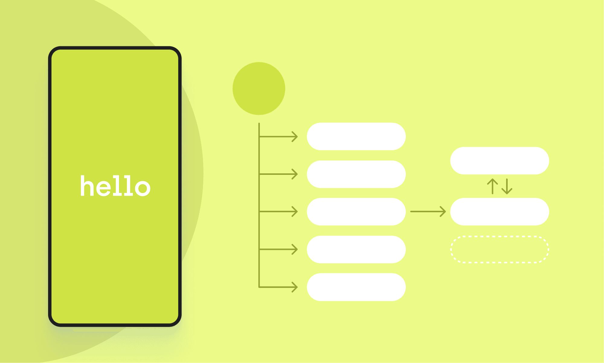
#1 Jakob's Law

Users spend most of their time on other sites. That’s why they prefer sites that work the same way as all the other sites.
This term was coined by Jakob Nielsen, a usability expert and co-funder of the previously mentioned Norman Nielsen Group.
To make it easy – users have certain expectations of your product, that were built based on using other sites or applications. For example, if somebody is a frequent user of Meta Messenger, it may expect other messaging apps to work similarly. The result? There is almost no learning curve, and users can start using the application right away.
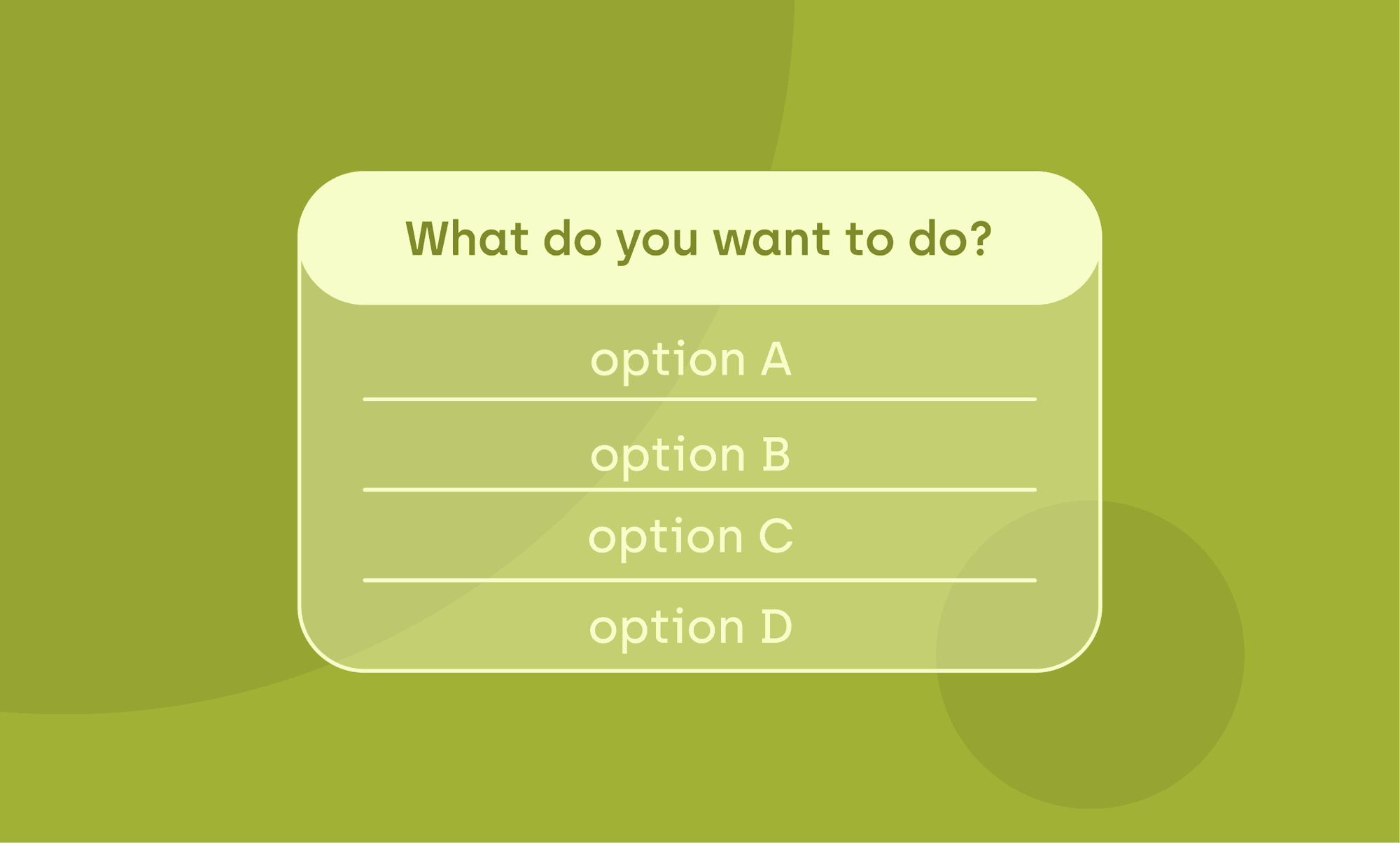
#2 Hick's Law
The time it takes to make a decision increases with the number and complexity of choices.
According to the Hick's law, the simpler, the better. You need to think about the cognitive load that comes with using the application or website. Each of us is equipped with a limited ability to process and use operational memory.
Do you need that additional window? Is the UX writing simple and to the point? Should this form be that long? These are some of the questions you need to ask yourself during your design process. It's a great way to make sure to lessen the occurrence of interrupted tasks in users interaction. It can, for example, boost website account registration or successful purchase from the website.
#3 Aesthetic Usability Effect

Users often perceive aesthetically pleasing design as design that’s more usable.
The Aesthetic Usability Effect was first observed in 1995 by Hitachi researchers – Masaaki Kurosu and Kaori Kashimura. They tested 26 variations of an ATM UI, asking the 252 study participants to rate each design on ease of use and aesthetic appeal. You can read more about this study case here.
The correlation between the participants' ratings of aesthetic appeal and perceived ease of use was stronger than the correlation between their ratings of aesthetic appeal and actual ease of use.
What does it mean for everyday design work? That it is important to keep the visual appeal in mind and create designs that will have positive emotional response in the testing phase of the project. You need to emphasize coherent branding, visual design and how related elements work with each other.
#4 Doherty Threshold

Productivity soars when a computer and its users interact at a pace (<400ms) that ensures that neither has to wait on the other.
The law has its roots in a research paper published in 1982 by Walter J. Doherty and Ahrvind J. Thadani in IBM System Journal. This paper set the requirement for the computer response time to 400 milliseconds, rather the previous standard of 2 seconds.
The faster, the better. You may think that's what it is to that rule. But it's much complicated.
The first statement is true most of the time. When system feedback is provided within less than 400 ms, it helps with user attention and productivity. Not only that, but the user journey suggests that the usage of animation can engage people while they are waiting for the site to load. The same goes for the progress bars – they can make anticipation tolerable and counteract user frustration.
But what about the “complicated” part? Well, you can delay the website on purpose. “But why would I do that!?” In certain circumstances, adding a delay may increase the perceived value and create a sense of trust.
#5 Fitt's Law
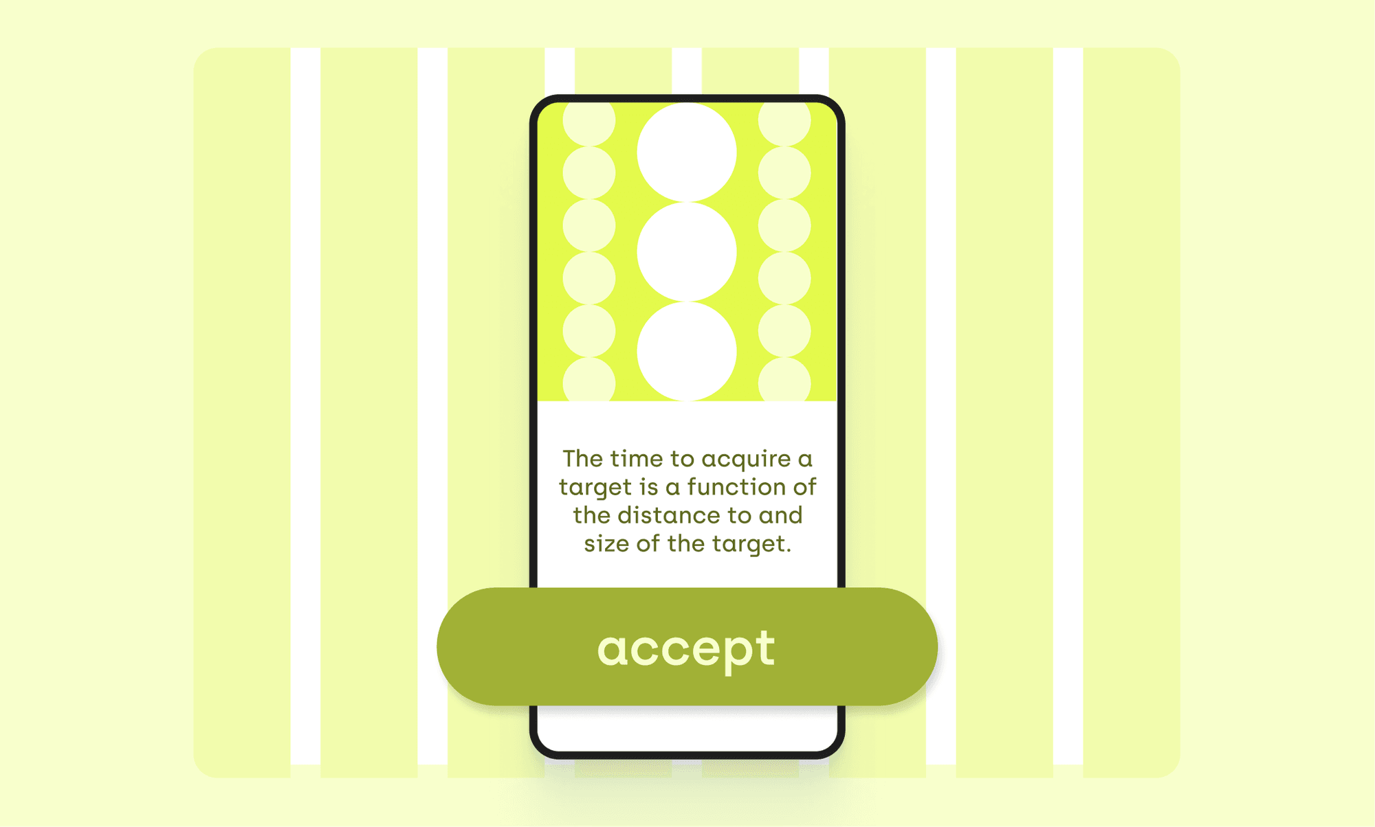
The time to acquire a target is a function of the distance to and size of the target.
The law has its origins in research conducted in 1954 by a psychologist, Paul Fitt. The researcher was examining the human motor system. The study indicated that the time required to move to the target depends not only on the distance to it, but also the size of a target.
What does that mean in the world of an UX designer? That, for example, smaller buttons are harder and more time-consuming to click on. Not only that, but the distance between where the users interact right now and will be headed next should be as short as possible.
#6 Tesler's Law
For any system there is a certain amount of complexity which cannot be reduced.
This UX law has been coined by Larry Tesler, while he was working at Xerox PARC in the mid-1980s. It has been brought to the world's attention in the book “Designing for Interaction” by Dan Saffer, where the author conducted an interview with Tesler. The titular designer argues in it, that each designer should put more work into their project to reduce its complexity – saving thousands of minutes for users.
However, Bruce Tognazzini argues with that – he suggests that people will always seek some level of complexity in their life – intentionally breaking already simple systems. The law of conservation of complexity can not only find its use in user interfaces of applications and websites, but also in vehicles, home appliances and in workplace equipment.
#7 Parkinson's Law
Work expands to fill the time available for its completion.
The sentence is actually a first sentence of a humorous essay published in 1955 by Cyril Northcote Parkinson. For a humorous observation, it has a lot of wisdom in it.
What do you need to do as a (for example) product designer? Limit the time it takes to complete the task, compared to the users' idea of how much time it will take. It will improve the user experience by shifting users' focus from complex tasks towards being surprised by your improvements.
One way to implement that is by leveraging such tools as autofill during user's journey. You can also reduce a number of fields that the user is required to fill out. Maybe some of them are not needed? Or can be accomplished further into the digital products' usage.
#8 Serial Position Effect
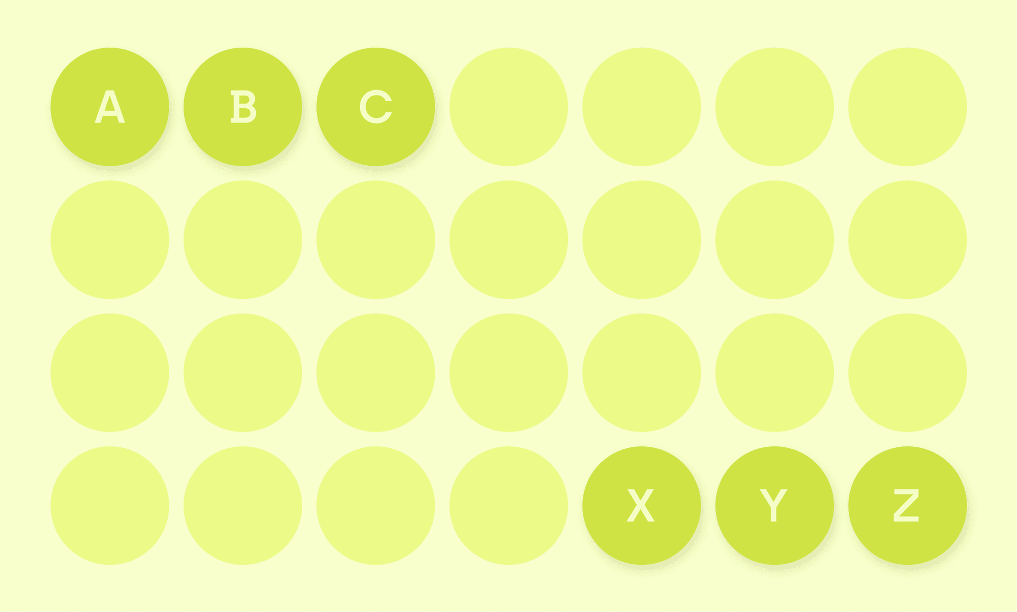
Users have a predispostion to best remember the first and last items in a series.
The term “serial position effect” has been created by Herman Ebbinghaus. It describes the way in which the position of an item in a sequence can affect its recollection. The first and the last item in the series tend to be the most memorable ones.
Placing the least important elements in the middle can help with navigation, as users prefer the first and the last items in the series – in this situation, interactive elements. The usage of this law can also be used to your company's advantage in branding and UX writing.
To give you food for thought: why does “ABC” and “XYZ” stand out from the whole alphabet? Maybe this has something in common with cognitive effort described by serial position effect?
#9 Pareto Principle

For many events, roughly 80% of the effects come from 20% of the causes.
Vilfredo Pareto principle stems its origin from the economist's remark regarding land ownership in Italy. He noticed that 80% of land was owned by the 20% of the population.
What does it mean? That instead of trying to always achieve 100% everywhere, you should put your work towards the field that will bring the most benefits to the majority of users. Be sure to examine your work: what will bring the most to the project, using the least amount of your energy. It's a good way of thinking when both time and energy are scarce.
Laws of UX – Summary
Those are just a few of the UX laws that are currently used by designers and creators worldwide. They often stem from psychology, economics, or design practice – but all serve the same purpose. Users tend to use applications in a very similar manner – and it's a change to meet users' expectations.
I encourage you to look for more examples of how the laws of UX are used in practice – each application, website, product holds a secret inside. Look for what motivates users, how human-computer interaction works, what kind of user interfaces are well attuned to a user.
If you liked this blog post, you should also check out:
Enhancing UX with Motion Design: From Theory to Practice by Anna Rózga
Why Does UX Writing Matter? Perspectives from the User, the Business, and the UX Writer. by Anna Rózga
How to Do a Rebranding of a Mid-Size Company? A Hero/Dot Success Story by Zuzanna Bomba
Need expert assistance with your digital project?