Bad UX Isn’t Just Annoying – It’s Expensive

Joachim Stelmach
Here’s what poor design is really costing your product, and what to do about it.
Let’s be clear: UX isn’t just about how something looks. It’s about how something works, and how easily users can do what they came to do. And when that experience breaks down, the costs stack up fast.
Poor user experience doesn’t always scream for attention. It shows up quietly: in rising support tickets, low onboarding rates, or user churn that no one saw coming. And often, it’s misdiagnosed as a marketing issue, a pricing problem, or “just something we’ll improve later.”
At hero/dot, we’ve worked with growing digital products across fintech, sports, and B2B platforms. Time and again, we see the same thing: when UX is neglected, the real cost isn’t aesthetic. It’s operational.
Here's how that plays out, and what you can do to change it.
1. Onboarding That Pushes Users Away
You only get one chance to make a first impression. If the first few minutes with your product feel confusing, slow, or overloaded with unnecessary friction, most users won’t stick around long enough to see its value.
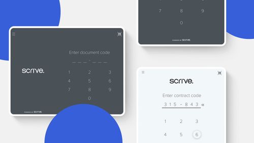
We’ve seen this across industries: multi-step sign-up flows with unclear progress indicators, missing confirmation states, or early feature dumps that overwhelm users before they understand the basics. In one case, simplifying an onboarding flow for a fintech app (cutting two redundant steps and clarifying the value proposition) led to a measurable increase in activation within just a few weeks.
Onboarding isn’t about showcasing everything your product can do. It’s about helping users succeed as quickly and smoothly as possible.
Hero Tip: Clarity beats cleverness. Your onboarding should guide, not test.
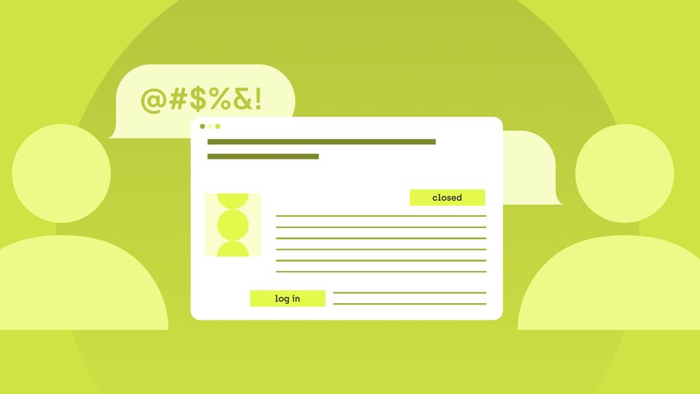
2. Support Requests That Don’t Need to Happen
If your support team spends hours each week answering questions like “Where do I find X?” or “Why isn’t this button working?”, the issue isn’t your users, but your interface.
When user flows are unintuitive or inconsistent, people don’t just give up. They open tickets. And while each one may seem minor, the cumulative cost adds up quickly: time, resources, and user patience.
Believe it or not, some chunk of support volume comes not from technical bugs, but from navigational uncertainty. By reviewing heatmaps, testing core flows, and applying clearer labels, one can reduce low-priority tickets and free the support team to focus on real issues. Not bandaids for bad UX!
3. The Silent Churn Problem
Users don’t always tell you why they stop using your product. They rarely mention UX in a survey. They simply disengage, because something about the experience didn’t feel worth the effort.
Often it’s not a single, glaring issue that drives them away. It’s an accumulation of friction: unclear error states, overly technical language, layouts that don’t work well on mobile. Even small frustrations build up until the user decides they’ve had enough.
Retention metrics don’t always tell the full story, but your interface often does. We’ve seen products improve weekly active usage and reduce churn just by resolving basic usability issues: more intuitive icons, clearer feedback after actions, and faster paths to core features.
4. The Root Cause: No One “Owns” UX
In many digital teams, everyone assumes someone else is thinking about the user. Developers build features. Product focuses on roadmap. Designers work on what’s asked.
But no one steps back to ask:
- Does this actually make sense to the user?
- Does the flow reflect how people think and behave?
Bad UX often creeps in when:
New features are layered on top of old ones
Interfaces are shaped by internal logic, not user goals
There’s no structured process for user feedback or flow testing
At hero/dot, we use lean UX cycles with real users and clear success criteria. It helps us spot these issues before they become expensive patterns.
UX insight: Good design isn’t decoration. It’s a system for helping people do things better.
5. What to Fix First (Hint: Not the Fonts)
You don’t need a full redesign to see results. Here’s how we usually help our partners turn things around, fast:
✅ Run a UX audit
Map the top 3–5 flows. Where do users drop off? What steps feel unnatural?
✅ Fix the core journeys
Focus on onboarding, key actions (like upload, purchase, save), and recovery paths.
✅ Test with real people
Even five usability tests can uncover game-changing issues.
✅ Design for distractions
Assume your user is busy, tired, and using one thumb.
✅ Get everyone involved
UX isn’t just for designers. Support, sales, devs. They all have useful signals!
Final Thoughts:
Bad UX doesn’t always make itself obvious. It creeps in quietly through rising support tickets, low activation rates, or features no one uses. These aren’t just usability issues. They’re business problems.
Good UX, on the other hand, creates momentum. It helps users get started faster, reduces churn, and lowers the cost of support. It makes your product feel intuitive, reliable, and worth coming back to.
At hero/dot, we treat UX not as a surface layer, but as a strategic tool. One that blends design thinking with real-world constraints, user behavior, and measurable outcomes.
Whether you're building from scratch or iterating on something that’s grown messy over time, we're here to help your product feel natural, not forced.
Need expert assistance with your digital project?
Recent from Joachim Stelmach